rhino.
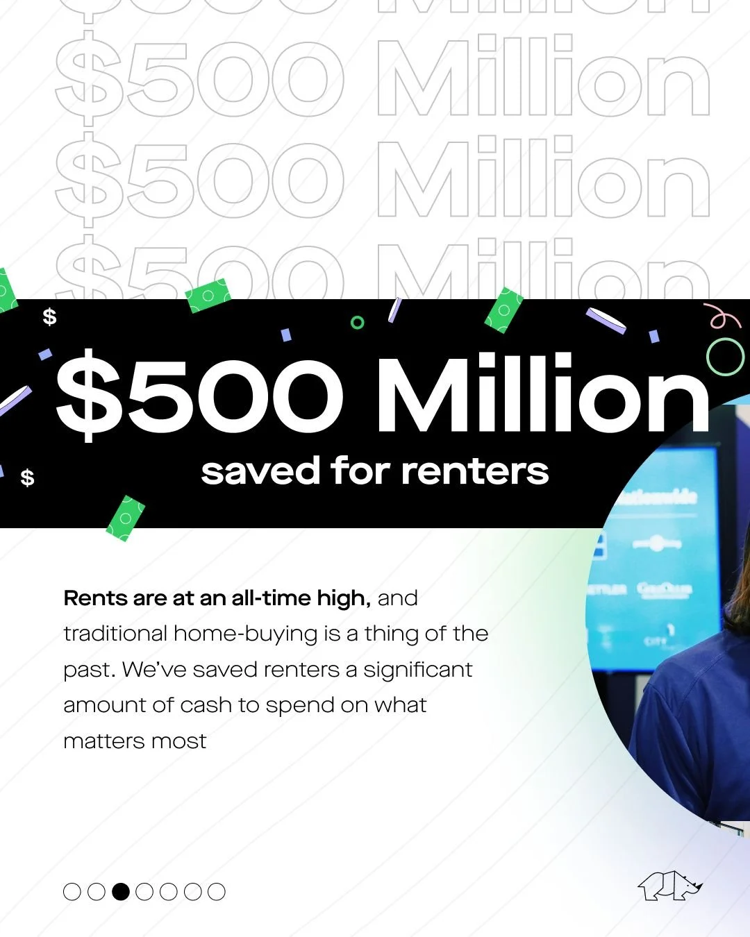
design + brand identity PortfolioRhino was founded to eliminate the need to pay traditional security deposits by replacing them with smart, affordable insurance so renters can maintain control of their cash. Instead of a large upfront cash security deposit, renters pay Rhino a small monthly fee, and Rhino insures the property owner for damages that might occur and lost rent. To date, Rhino is offered in almost 2 million homes and has saved renters over $500 million in cash.
ABOUT.
rhino — 01
Name
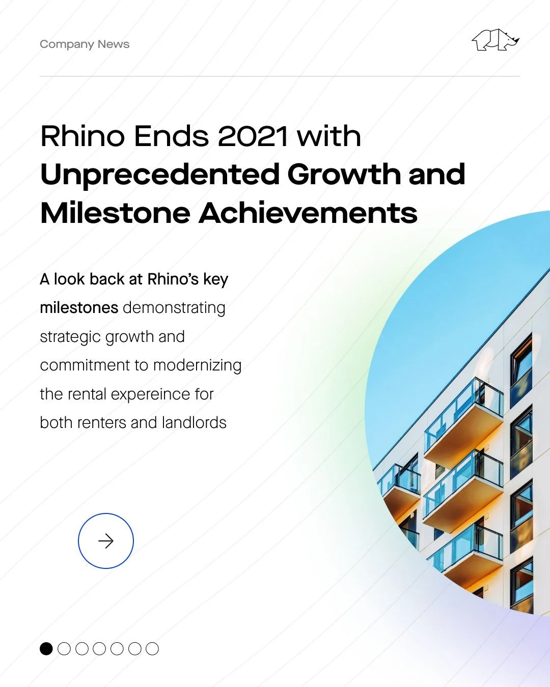
End of Year Company Milestone Carousel
Type
Visual Design — Carousel
Category
Company News + Employer Branding
-
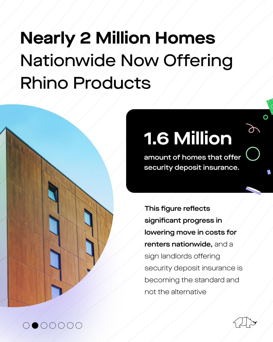
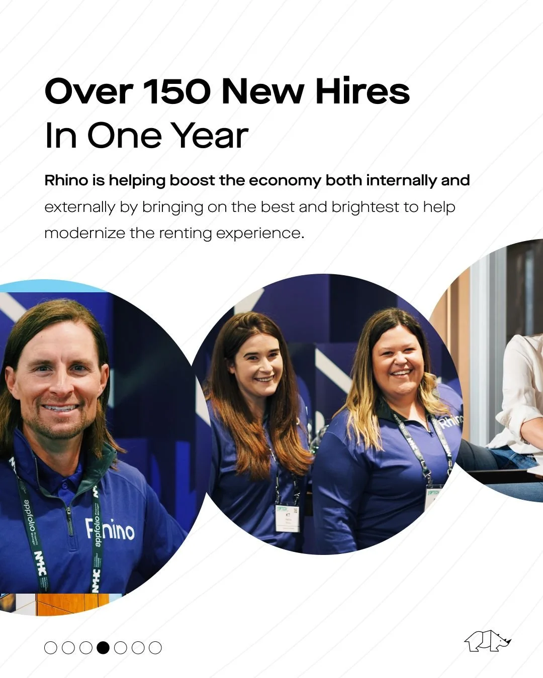
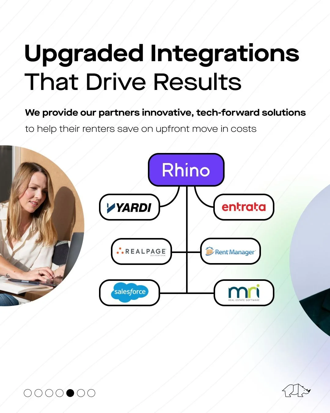
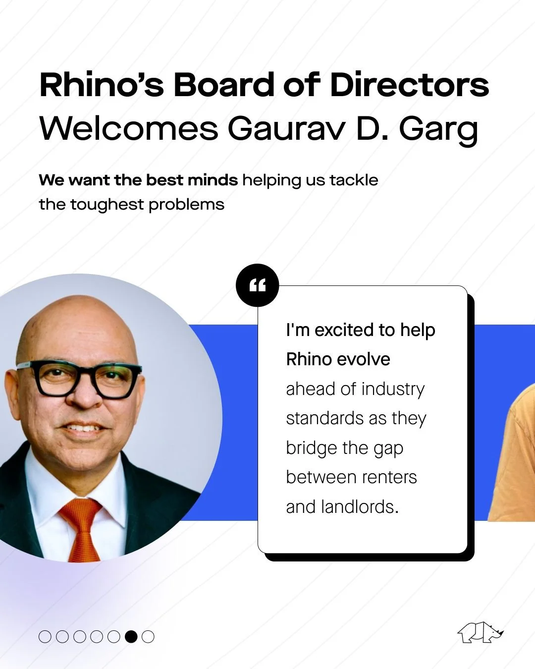
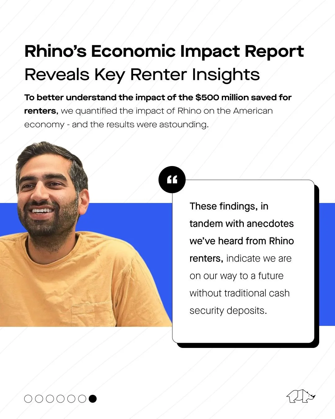
Our objective was to create a dynamic multi-platform promotional piece on social media, strategically designed to spotlight Rhino's 2021 milestones. These achievements, ranging from empowering nearly 2 million homes nationwide with Rhino products to saving renters $500 million, presented a unique challenge of consolidating diverse successes in a visually engaging format. Our broader aim was to drive brand awareness within our B2B2C target personas—property owners and real estate operators (B2B), and renters (B2C). Simultaneously, we sought to enhance engagements, direct traffic to our press release linked here, and encourage employee reshares on LinkedIn to amplify reach. This strategic approach aimed to increase demo bookings and prospecting opportunities within our B2B audience.
-
Leveraging the newly released carousel format on LinkedIn, prioritized for engagement, we devised a strategy to cross-promote on Instagram for visual consistency. The design incorporated elements from subsequent slides as pagination, fostering user retention and creating the illusion of a single, fluid design. The goal was to ensure that, figuratively, if laid out next to each other on a table, the carousel would appear cohesive, rather than a collection of disparate design assets. Inspiration was drawn from prioritizing white space, providing flexibility to introduce multiple colors and design elements. This approach aimed to maximize engagement without overwhelming the audience, allowing each subsequent slide's layout to seamlessly overlap with the others.
-
rhino — 02
Name
‘On the Horn with…’ Podcast ⋅ Hosted by Rhino CEO, Paraag Sarva
Type
Visual Design
-
Our mission encompassed creating a resonant name for Rhino CEO Paraag Sarva's podcast, crafting visually compelling cover art, and designing a versatile template for cohesive visual assets. These assets were intended for seamless promotion across social media platforms, ensuring easy integration with each episode's unique details. The template needed to facilitate plug-and-play functionality for both Paraag Sarva and guest headshots, ensuring a consistent and stylized visual identity across promotional materials. Additionally, we undertook the production of the podcast, managing everything from sound design for intros and outros to each individual episode, to hosting and publishing on platforms like Spotify and Apple. This comprehensive approach included updating episode-specific cover art for each publication.
-
The podcast name, 'On the Horn with...,' emerged from the conversational essence of phone calls, offering succinct and engaging copy possibilities for promotional materials. The cover art design embraced authenticity, featuring a candid, black-and-white headshot of Paraag against a monochromatic backdrop. We strategically used Rhino's brand color, purple, to make the logo pop. The title was presented in a bold, modern typeface, with a repeated outline in the background for visual interest and readability. The cohesive template for episode promotion on social media ensured a unified visual identity across all platforms.
-
Category
Podcast + Social-First Content Series
rhino — 03
Name
#JoinTheCrash and #MoveWithRhino
Type
Visual Design
Category
Company News + Employer Branding
-
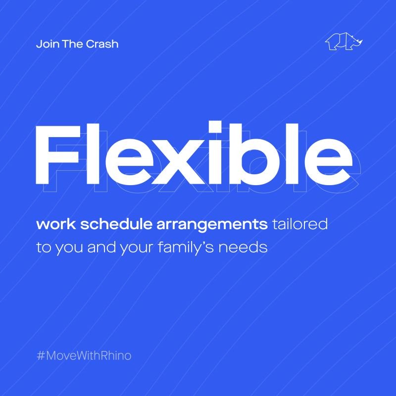
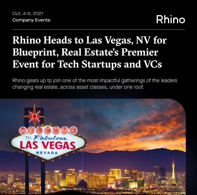
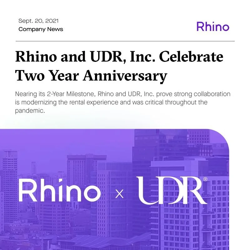
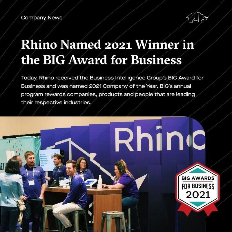
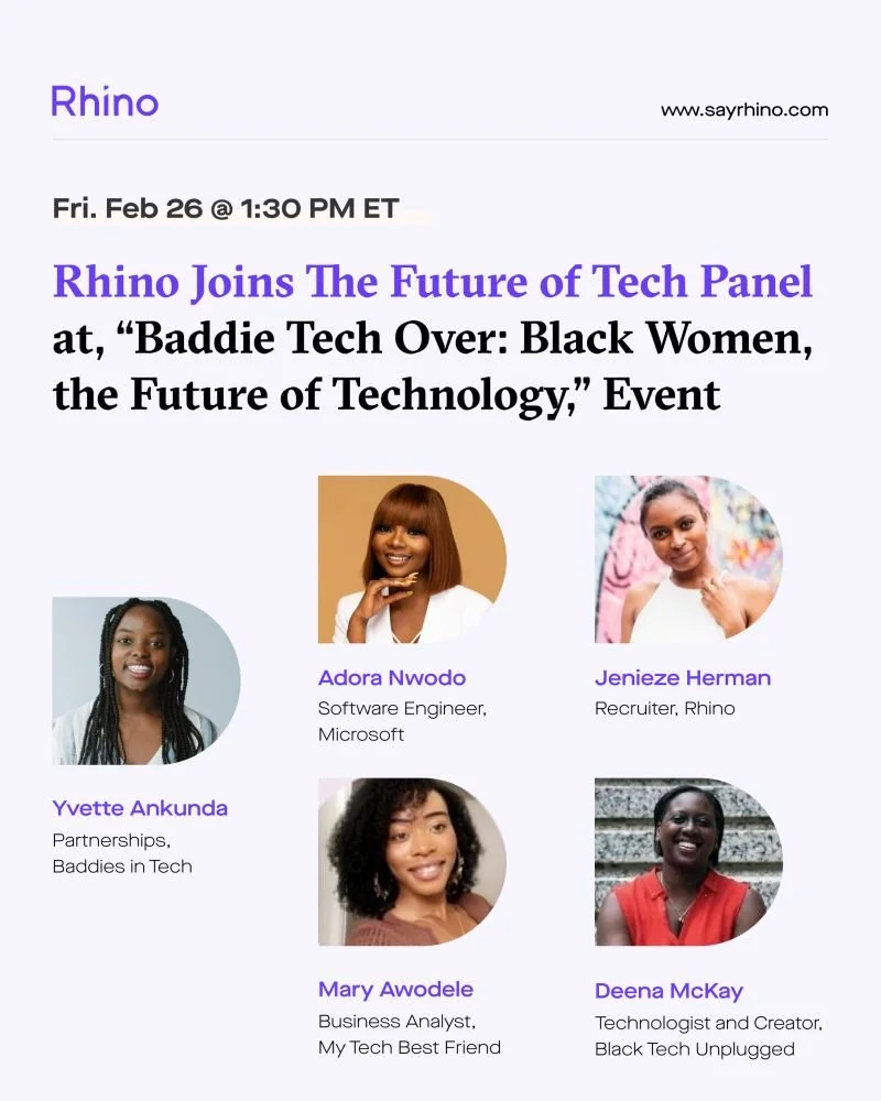
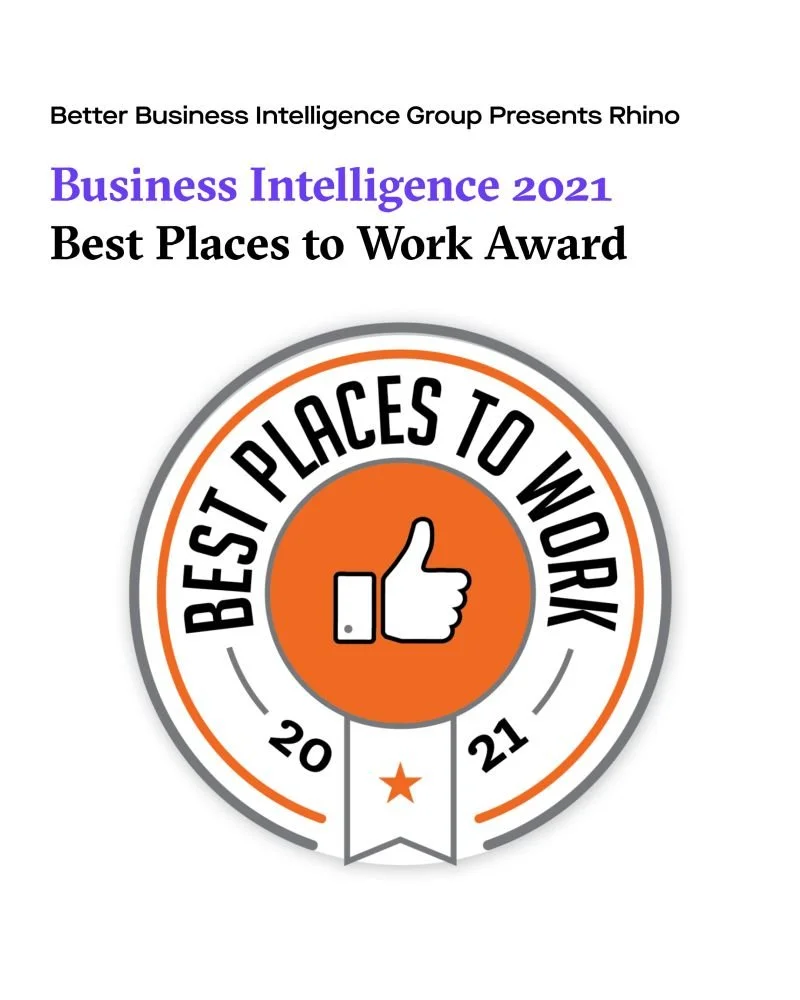
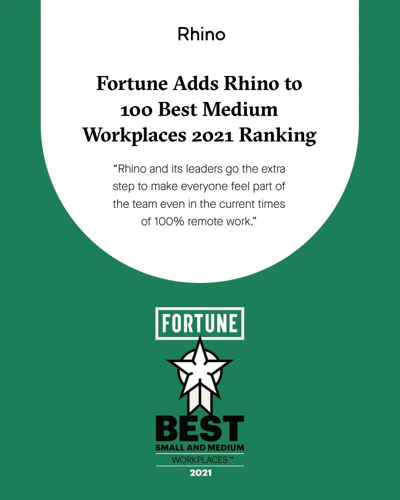
Our objective was to design a versatile yet templatized set of assets for Rhino's Company News and Employer Branding Content Series on social media. The series aimed to promote virtual and live real estate tech events, press releases, and talent acquisition content highlighting the company's benefits for working parents. The assets needed to balance consistency and visual variety, incorporating photographs when possible. For press release-related content, we prioritized incorporating the logos of media outlets to enhance brand recognition and credibility. Additionally, the assets carried designated hashtags - #MoveWithRhino for company news and events and #JoinTheCrash for talent acquisition content.
-
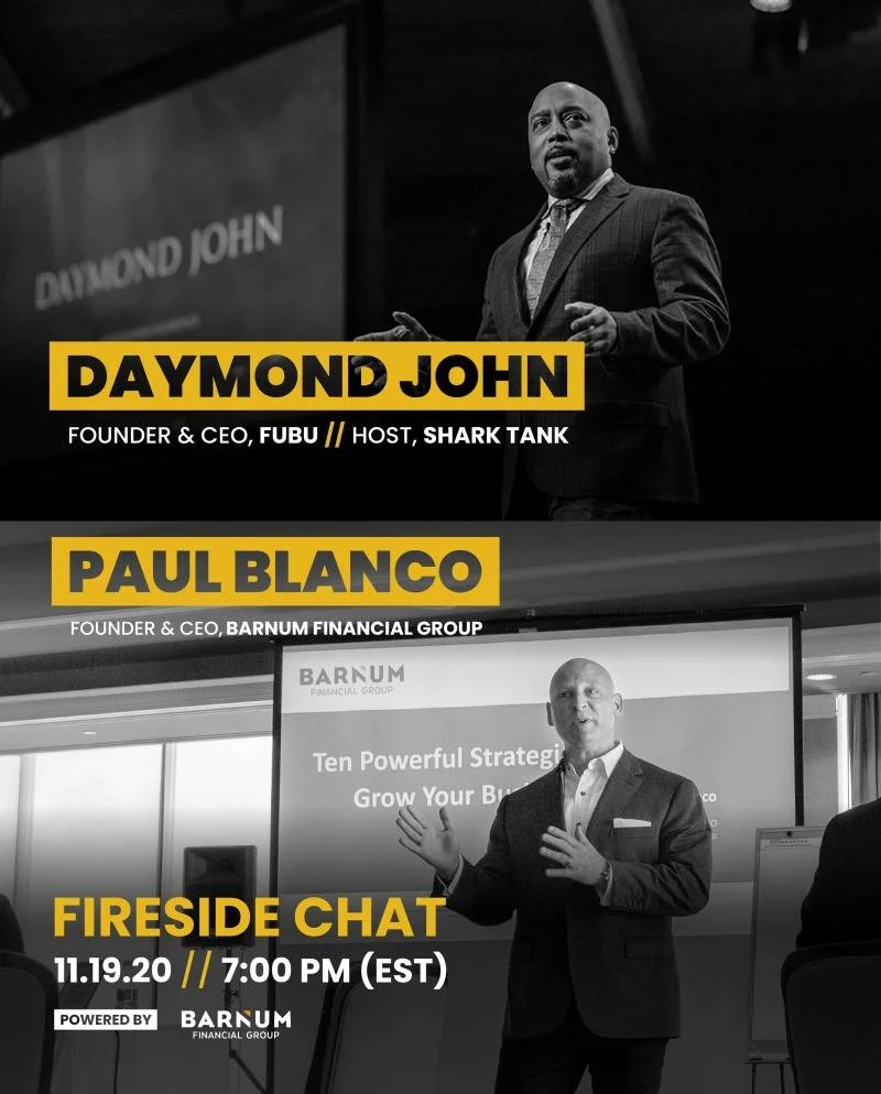
Our approach focused on visual interest, particularly for assets requiring the use of photographs. For content related to live events, we ensured bold, unique, and geo-specific photos that showcased famous landmarks in the event's host city. Clear visual hierarchies were implemented for text-driven assets, especially those related to employee benefits for parents. This included headings and subheadings to create a scroll-stopping effect on social media feeds, capturing the attention of users as they scrolled through their content.
-
Figma | GIPHY | Tenor


